The 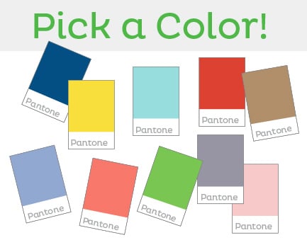 Pantone Color Institute™ just released the color forecast for spring 2016, and it is full of emotion-evoking color suggestions for fashion, products, home décor and consumer campaigns.
The canvas of colors include: Rose Quartz, Peach Echo, Serenity, Snorkel Blue, Buttercup, Limpet Shell, Lilac Grey, Fiesta, Iced Coffee and Green Flash.
So who is the Pantone Color Institute, and why does everyone listen to them?
Pantone is the foremost authority on the use of color. Every season a highly select collective of uber edgy creatives (mostly designers) from around the globe get together and discuss the state of color on a global scale. From their discussions, they glean a world-view of how designers are using color and why. They couple that knowledge with their extensive research-based understanding of how people connect with color to choose a Top 10 color palette that reflects those ideas and trends.
According to Leatrice Eiseman, executive director of the Pantone Color Institute, the new colors “transport us to a happier, sunnier place where we feel free to express a wittier version of our real selves. With our culture still surrounded by so much uncertainty, we are continuing to yearn for those softer shades that offer a sense of calm and relaxation."
How can you incorporate these fresh, new colors into your marketing strategy?
Pantone researchers have gathered emotional responses to each color. You can see this data outlined on the Pantone website. As you develop your spring product line, advertising campaign or other consumer touch points, consider the emotional appeal that your customer may experience when engaging with your brand and if any of the colors resonate with your marketing message.
Colors can be used on products, in patterns, in typography and illustrations. Consider using several of the colors together to create your own mini-palette. All of the colors from the new palette will work together in any combination.
But remember -- these colors should complement your messaging without diluting your overall brand.